CHOW TAI FOOK’S LOGO OVER THE YEARS
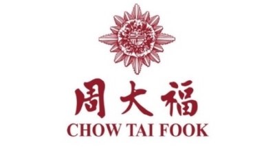
A bold work of calligraphy spelling out the store’s name “Chow Tai Fook” dominates Chow Tai Fook’s first generation logo. It symbolises the proud history of Chow Tai Fook gold jewellery store and the value of hard work espoused by the people who built this brand. In the centre of the star shaped medallion, the characters “Tai” and “Fook” represent hope and prosperity for the nation and its people, as well as Chow Tai Fook’s best wishes for the people and community it serves.
Building on the foundation of the logo of the previous generation, the second generation logo becomes more streamlined to attest to the growth of Chow Tai Fook. Chow Tai Fook was among the first gold jewellery store to incorporate as a limited company, and began selling gem-set jewellery. While industry competition was still fierce at that time, customers became more sophisticated when it came to purchasing and appreciating jewellery.
Chow Tai Fook’s third generation logo is composed of two stylised letter Cs, offering a contemporary feel and a sleek look. The logo not only catches up with the ever-changing world around it, but also suggests a bright future of Chow Tai Fook as a leading jeweller in China. The dynamic double-C design of the new visual identity also underscores innovation, industry, and energy of the Chow Tai Fook team, as well as the unique characteristics of the jewellery business.

The fourth generation logo consists of two boxes, with Chow Tai Fook’s name written in Chinese on the left, and in English on the right. The bilingualism alludes to the link between the East and the West, as Chow Tai Fook embarks on the internationalisation strategy. The burgundy red background symbolises Chow Tai Fook’s ever-growing reputation and immense brand value, as well as the trust the Group has earned from its customers. The white foreground is combined with an elegant and clean typeface, which highlights Chow Tai Fook’s leadership in the luxury goods market.

Drawing on minimalist aesthetics, the fifth generation logo is further streamlined to reflect the meanings of “sincerity and eternity” behind the Chow Tai Fook brand. Chow Tai Fook uses “China Red” as its logo’s primary colour, as a sign of continuing the Chinese traditions and culture, and harnessing its corporate strength to forge ahead. Written in two languages, Chow Tai Fook’s brand name is enclosed with a clean and graceful rectangular design, which suggests a trusted brand built on decades of professionalism, dedication, and integrity.


